UnPhone
App Design
A small company I co-founded that gives rewards to students for locking their phones to focus in class. All the designs from mockup to UX is by me.
Color Palette
#ff7417unphone orange
#ff9525light orange
#ffca12orange yellow
Final Output
We went through a short design study to create this logo, which would also dictate and influence the designs that we will create, following a specific look and feel that would shape the identity of UnPhone.
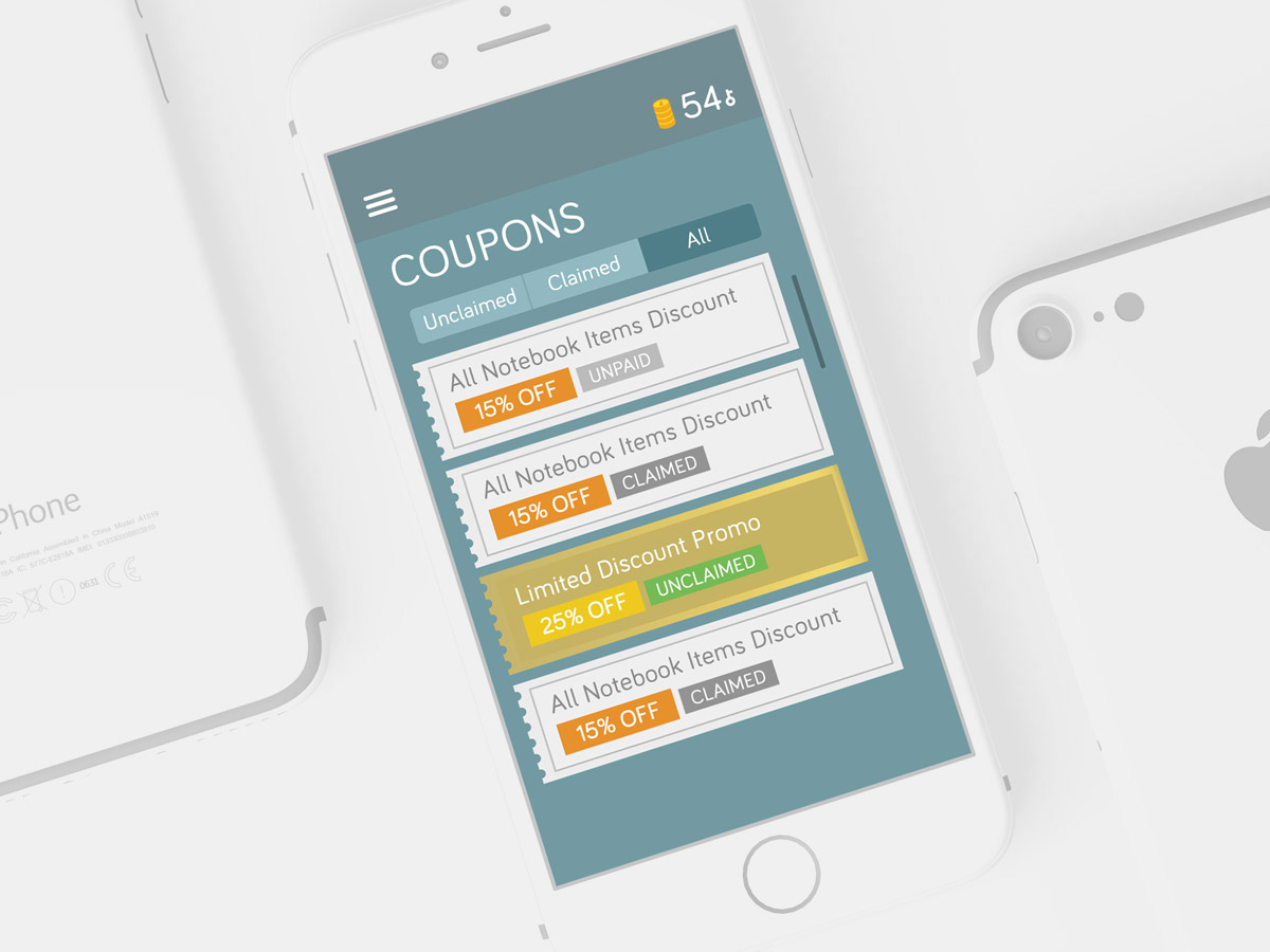
App Design
We designed some elements to intentionally go beyond the typical structured appearance of an app.
While we aimed to make the design more playful, we also maintained the alignments and proportions of a well designed app.
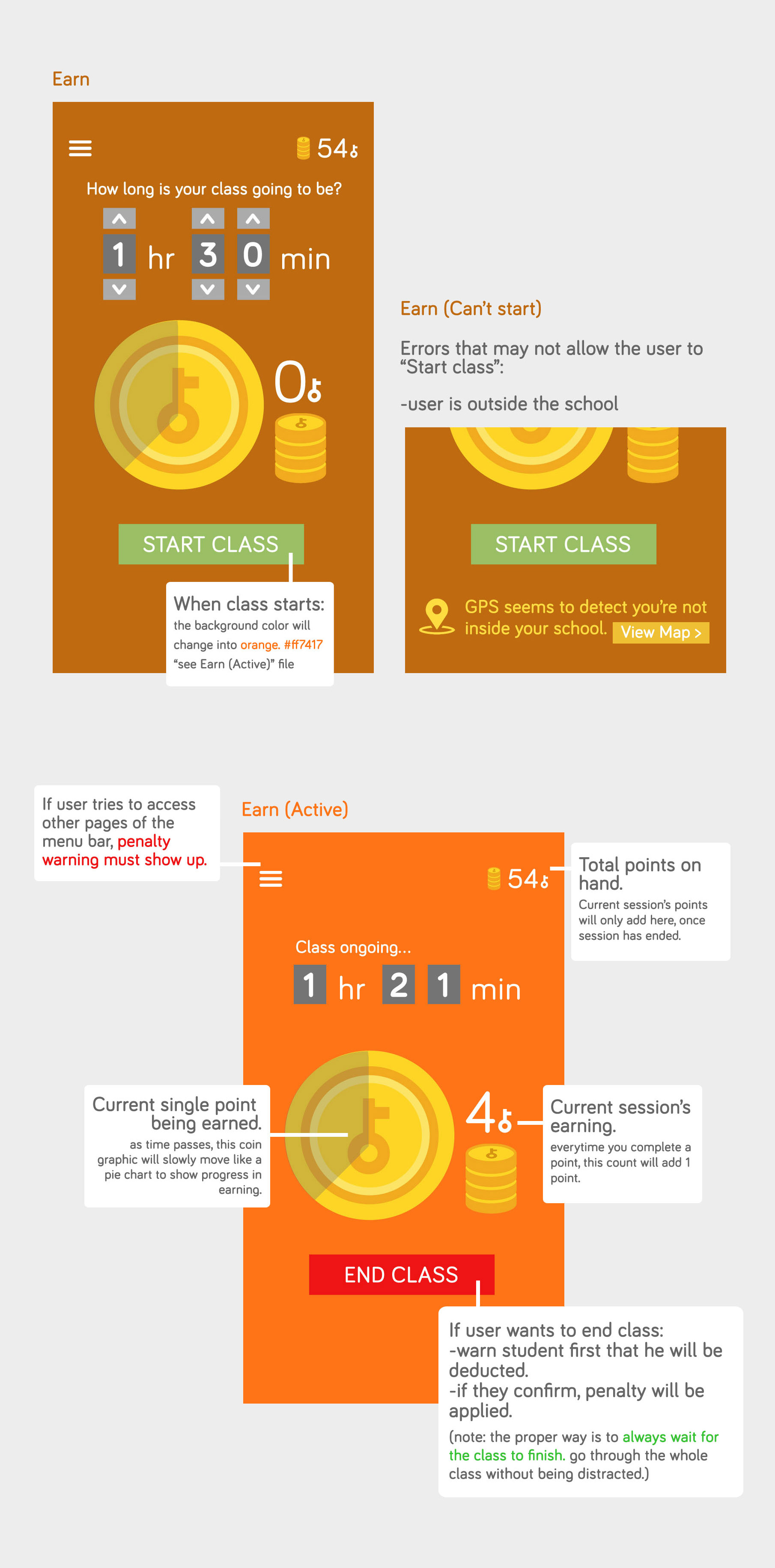
UX Design
An insight on how the UnPhone App was designed to behave. A prime example of which is the very main page- where students will spend most of their time on screen. The ease and convenience of the user is in mind in each outcome and step.