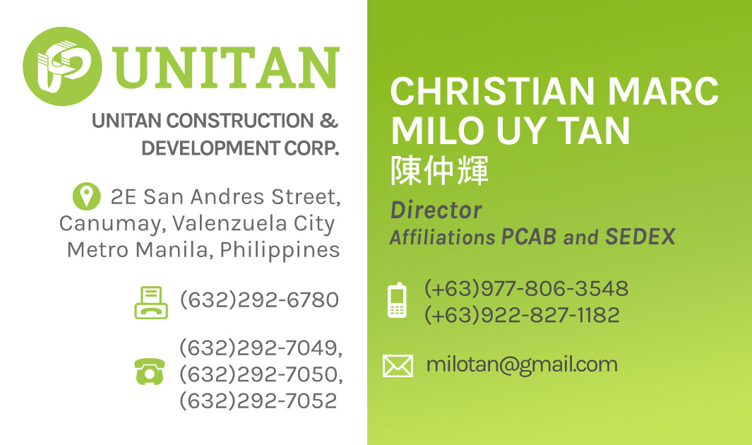
UNITAN
Brand Identity
A construction company based in Metro Manila, with whom I have been working with long-term to update and maintain their corporate branding's style and image to have a more modern and strong presence.
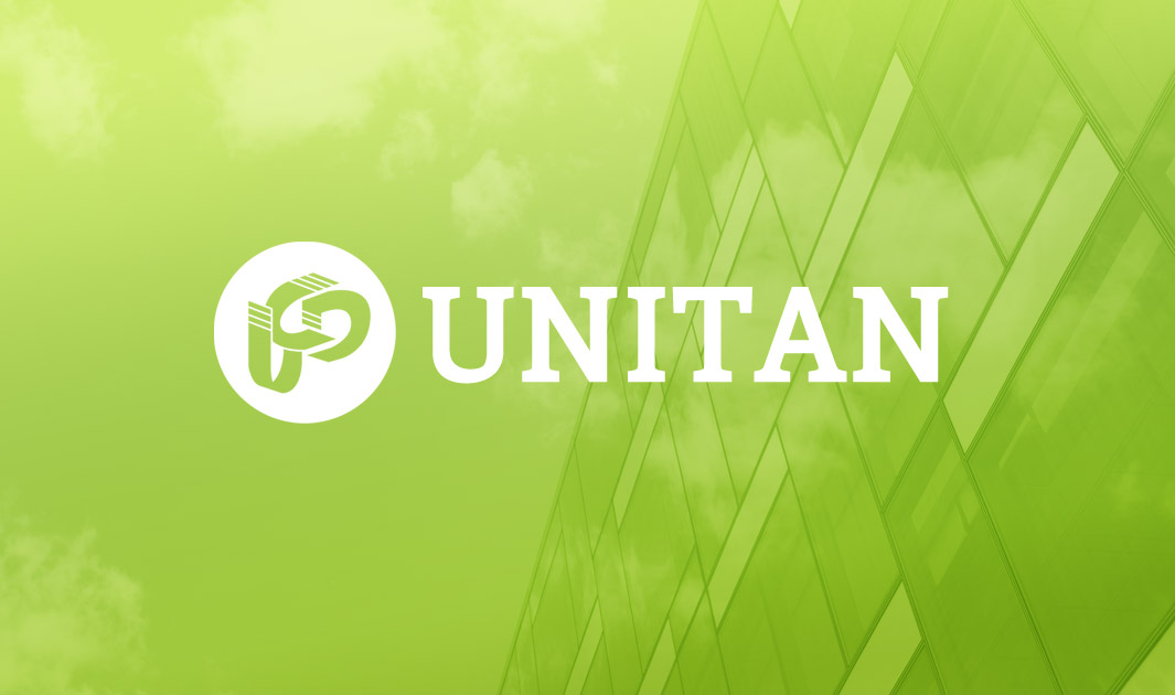
Flattened + Realigned Logo
While we had to retain the original logo's form and concept, we were allowed to update the style: Remove unnecessary gradients and shadows to allow the logo to take a more minimal and flat design, and make the lines of the logo's angles & alignments more proportional. With some discussion with the client about which elements and designs they liked best, we were able to finalize with this design.
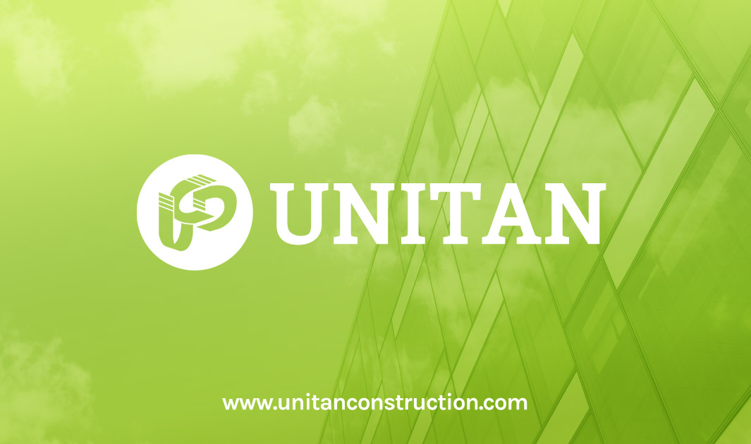
Back Design
For added effect, the back side was utilized as a space dedicated to the logo only. This gives more exposure to the logo and creates more impact for the company's identity.
Front Design
Since the client wanted a lot of information on the card, it was a challenge to fit it in the size of a business card. But it would still be possible with just some smart use of space.